BRANDING
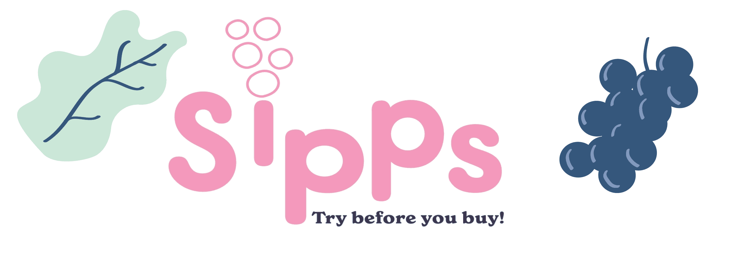
Sipps
Sipps is an affordable, convenient, and easy-to-navigate platform for beginners and anyone who wants to know what kind of wine to buy. This was a 3 month long project.

KEY DELIVERABLES
Product
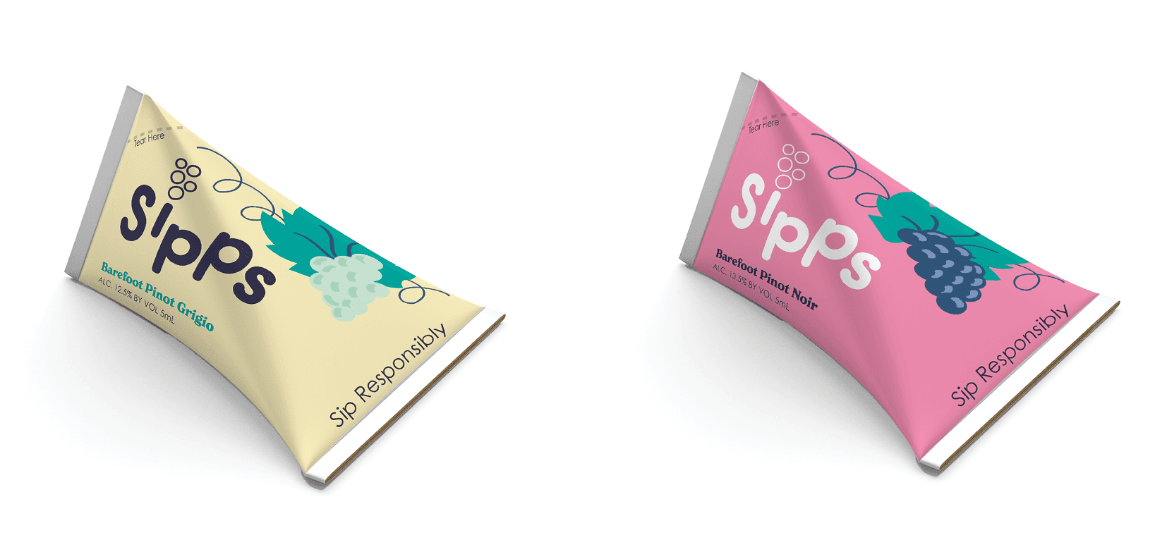
Tiny packaging that is eco-friendly,
and color-coded by red or white.
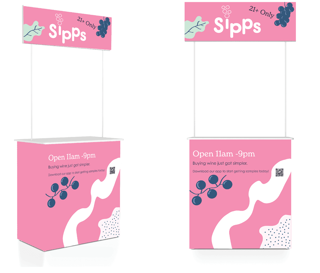
Kiosk
A kiosk where you would scan your app to receive the samples.
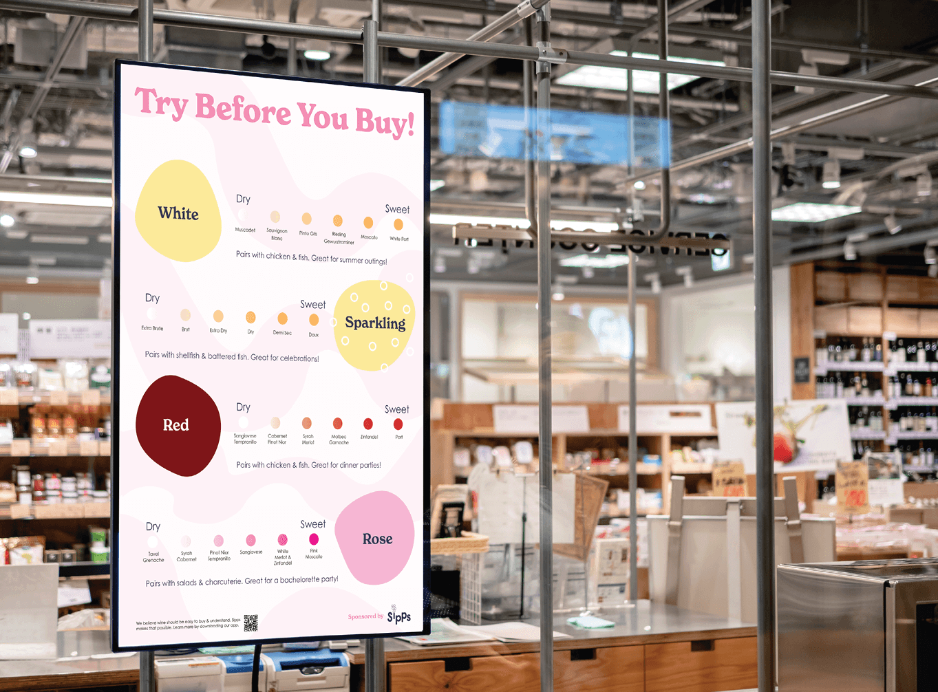
Poster
To help people make quick decisions on what wine they want.
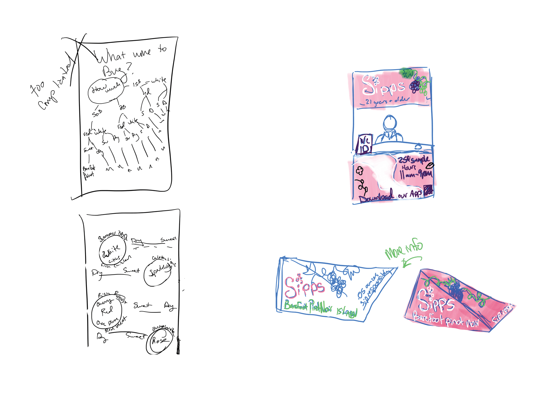
DELIVERABLE SKETCHES
O.riginal poster idea of helping people decide what wine to buy as well as what I wanted the product and kiosk to look like
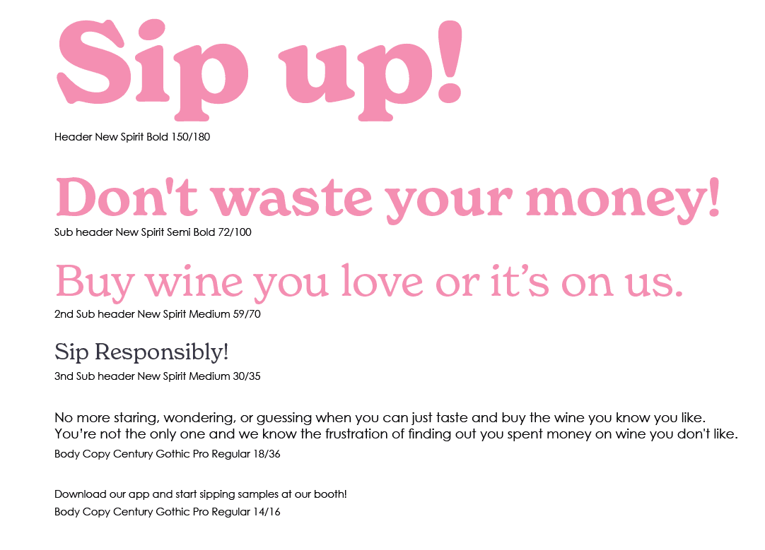
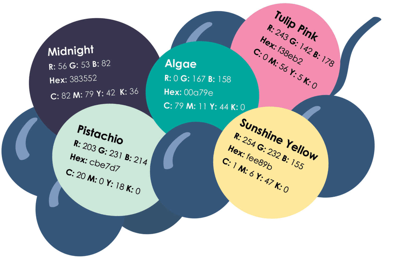
TYPOGRAPHY AND COLOR
New Spirit Bold for headers paired with Century Gothic Pro for body copy. New spirit was chosen for it's youthful fun feeling , and the colors were chosen as similar to colors seen in grapes for an organic feeling as well as youthful.
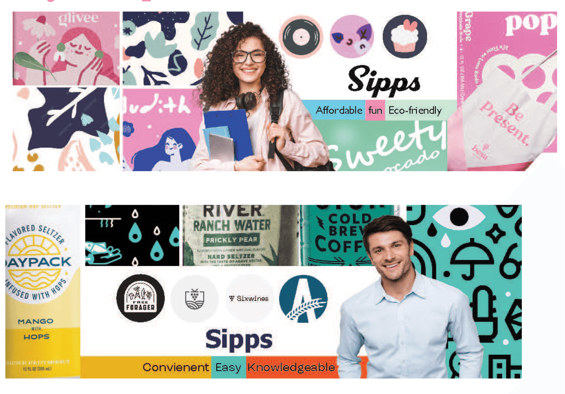
STYLESCAPES
Stylescapes created to define the target persona. The top stylescape featuring the Gen Z styled woman was chosen as the direction, targeting young novice wine drinkers with an affordable, fun, and eco-friendly brand approach.
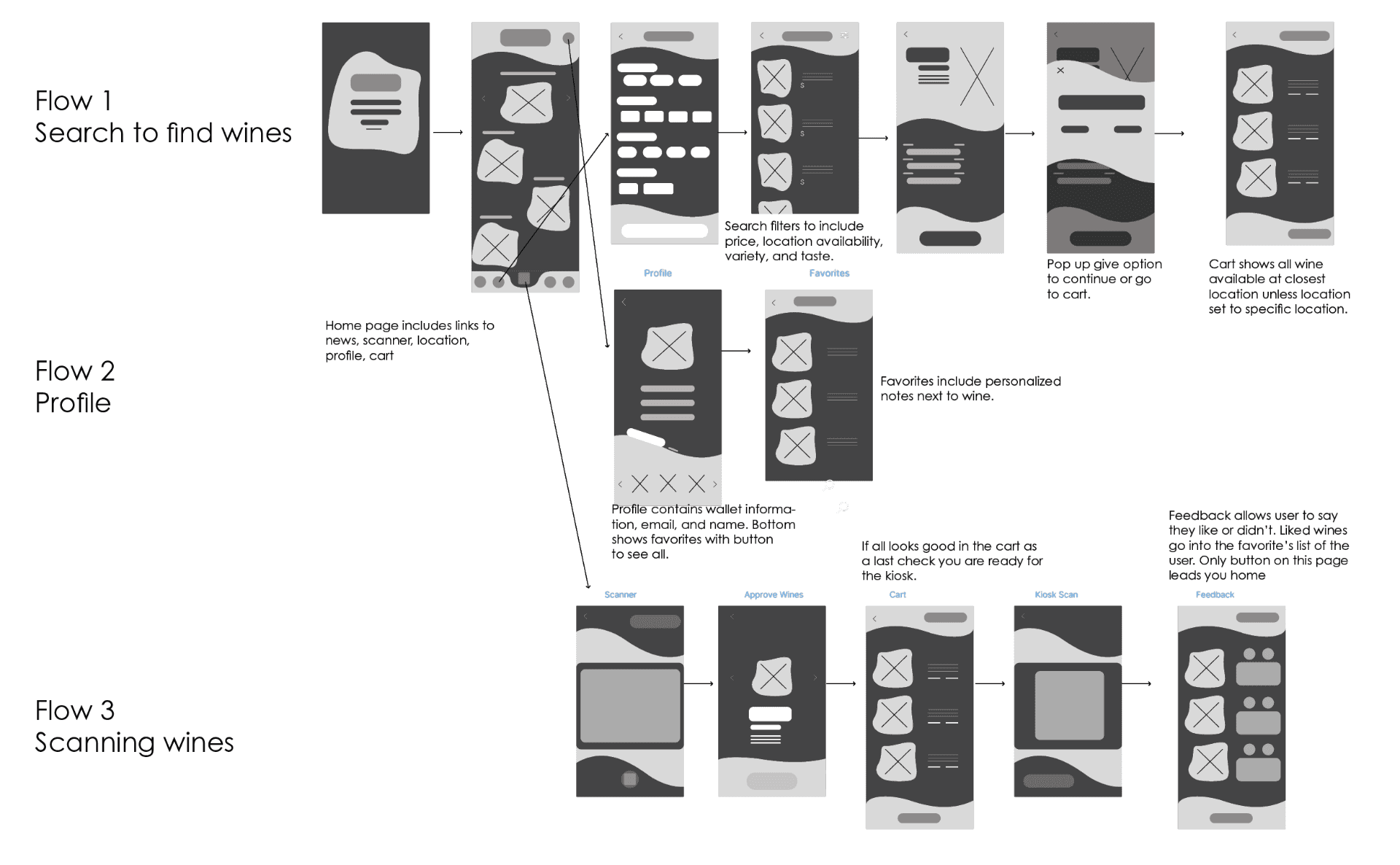
App Design Process
App Mockup
Here is some of the main screens that show off the process of scanning and trying the wine.
View Prototype
View Prototype
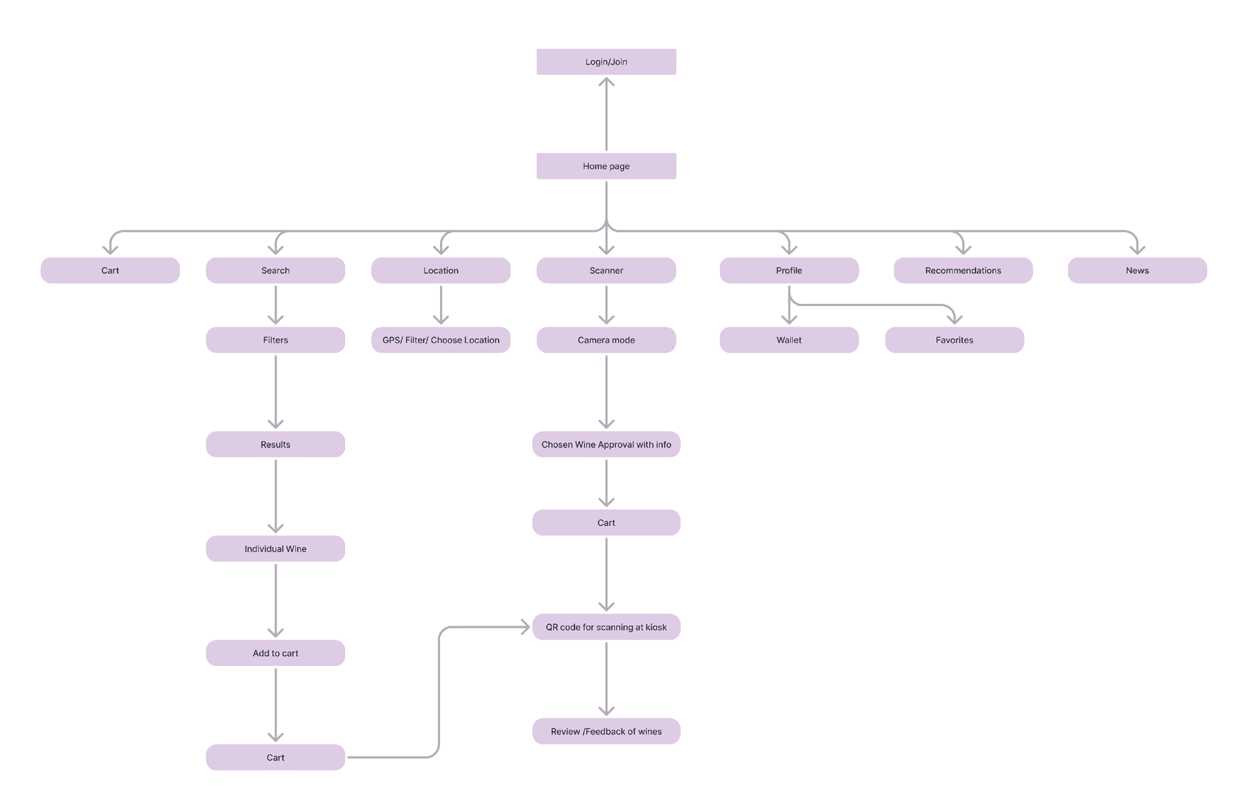
Sitemap
User flow architecture from login through cart, scanner, and feedback
Wireframes
I had three flows so you could see how the profile worked along with how you would scan and rate wine all in the app.
LOGO EXPLORATIONS
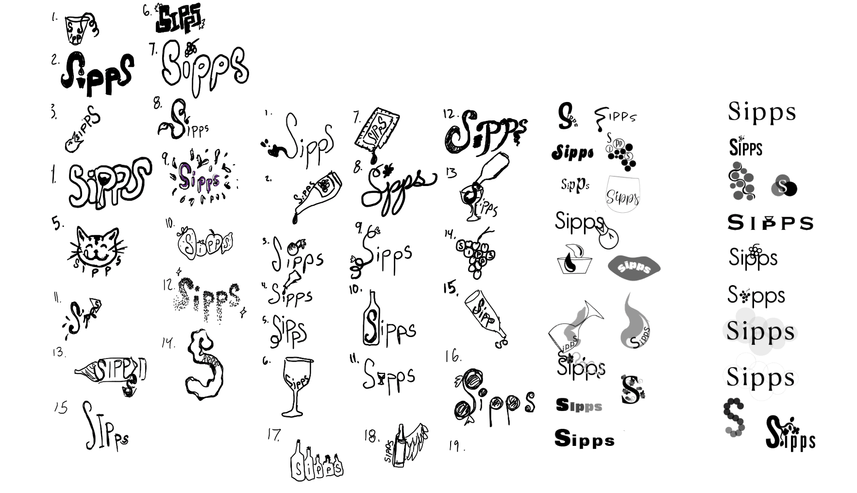
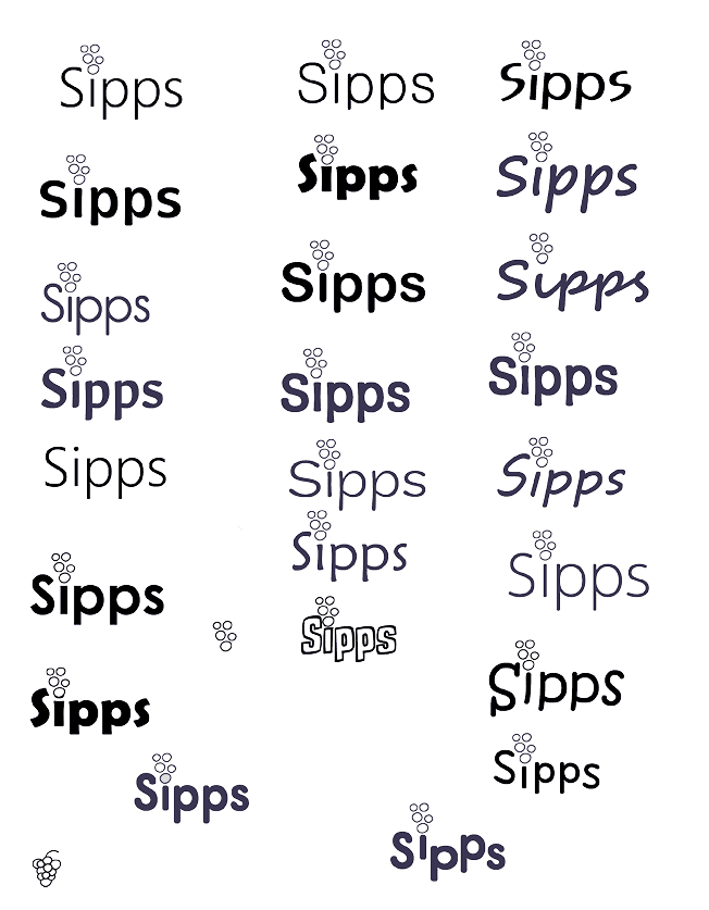
I started off with making very illustrative logos and then went towards a more basic round san serif with round grape like shapes on top with the p's going up and down for a playful look.
COMMERCIAL
A 49-second commercial showcasing what the brand is all about through fun visuals and a guide through the app
BRANDING
Sipps
Sipps is an affordable, convenient, and easy-to-navigate platform for beginners and anyone who wants to know what kind of wine to buy. This was a 3 month long project.
Sipps is an affordable, convenient, and easy-to-navigate platform for beginners and anyone who wants to know what kind of wine to buy. This was a 3 month long project.
KEY DELIVERABLES
Kiosk
Kiosk where you would go to scan your app and receive the samples.
Product
Tiny packaging that is eco-friendly, and color coded by red or white.
Poster
To help people make quick decisions on what wine they want.
STYLESCAPES
STyleScapes
Stylescapes created to define the target persona. The top stylescape featuring the Gen Z styled woman was chosen as the direction, targeting young novice wine drinkers with an affordable, fun, and eco-friendly brand approach.
TYPOGRAPHY AND COLOR
Original poster idea of helping people
decide what wine to buy as well as what
I wanted the product and kiosk to look like.
APP DESIGN PROCESS
New Spirit Bold for headers paired with Century Gothic Pro for body copy. New spirit was chosen for it's youthful fun feeling , and the colors were chosen as similar to colors seen in grapes for an organic feeling as well as youthful.
App Mockup
View Prototype
Here is some of the main screens
that show off the process of scanning
and trying the wine.
Sitemap
User flow architecture from login through cart,
scanner, and feedback
I had three flows so you could see how the profile
worked along with how you would scan and rate wine
all in the app.
Wireframes
LOGO EXPLORATION
I started off with making very illustrative logos and then went towards a more basic round san serif with round grape like shapes on top with the p's going up and down for a playful look.