POSTER DESIGN
GROWTH
Two artists, nature, growth
DESIGN PROCESS
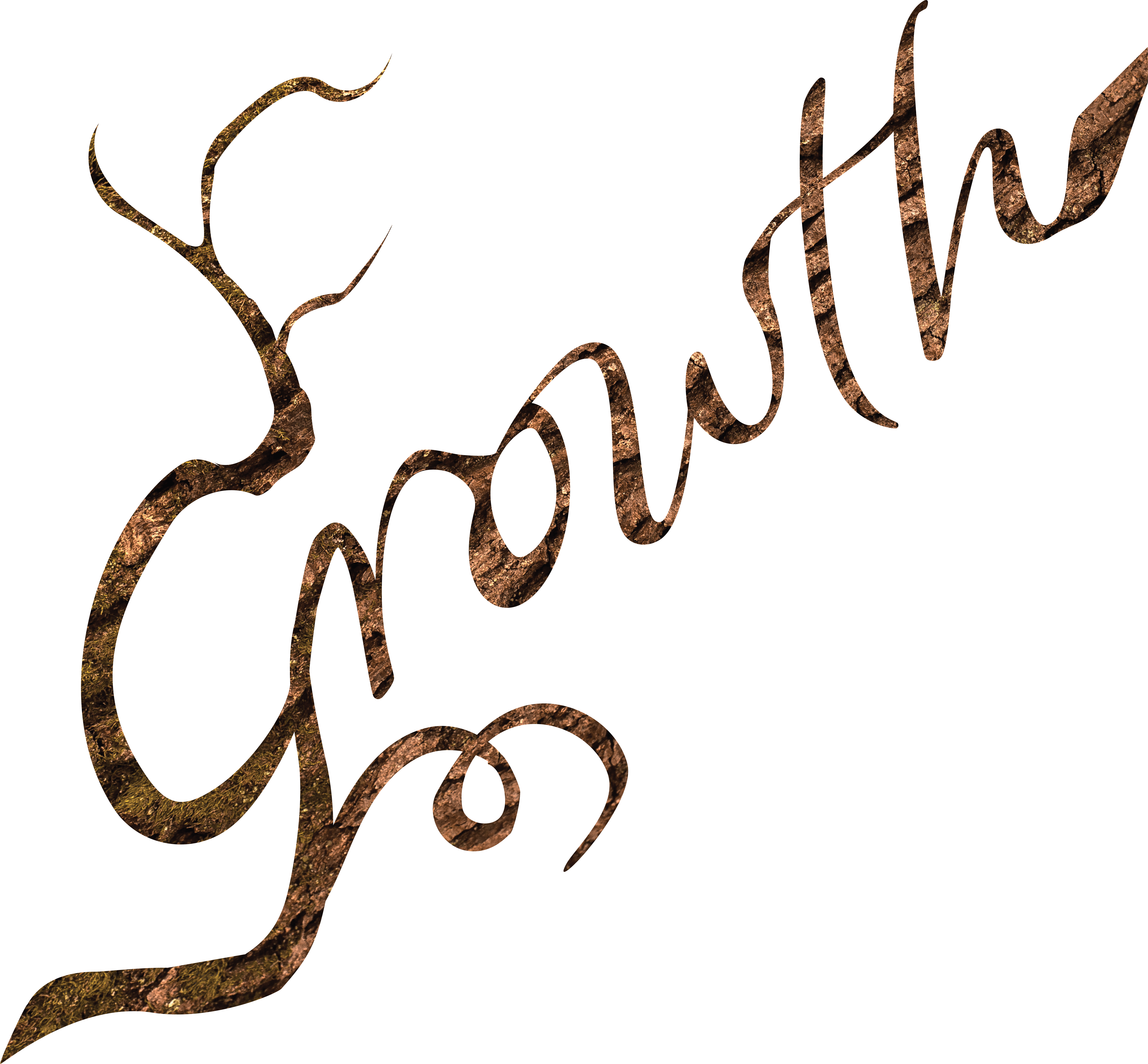
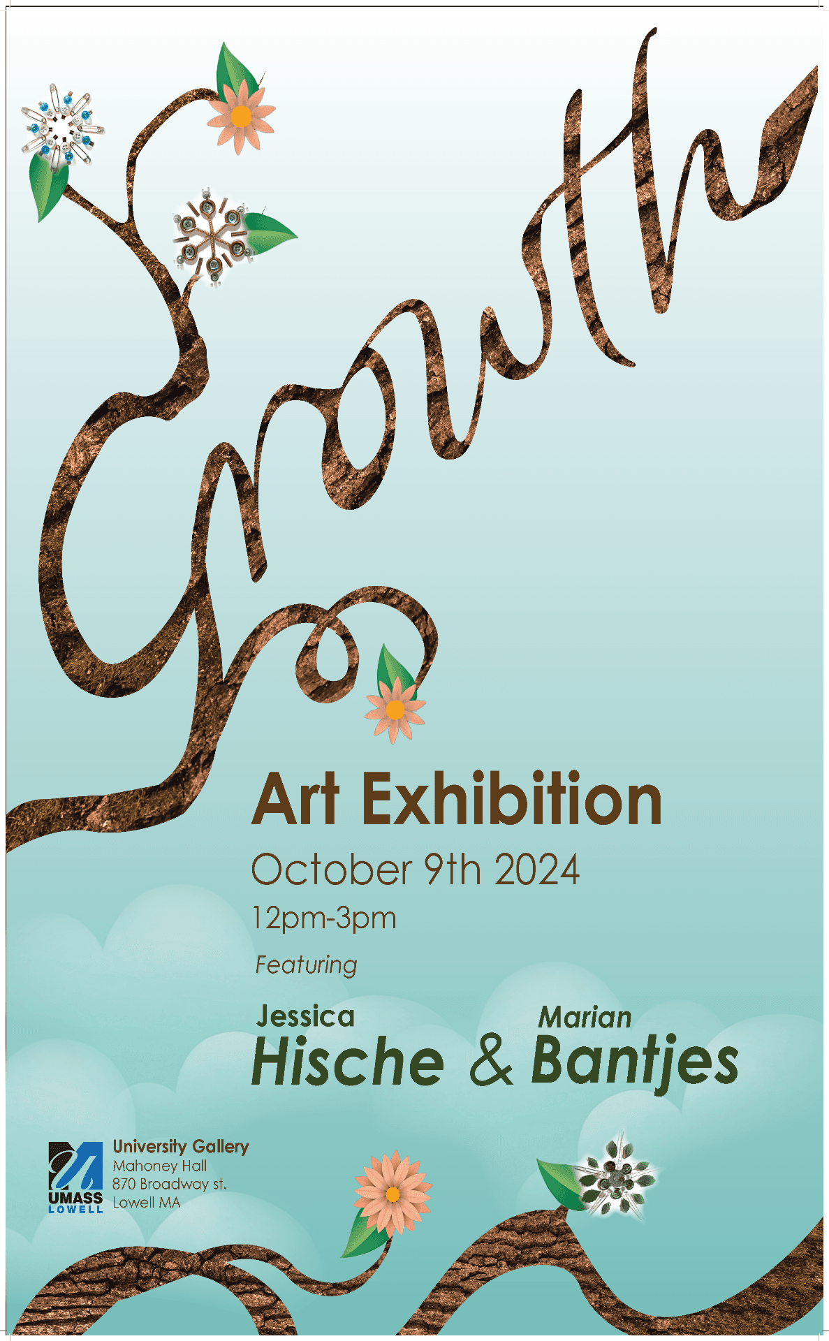
Two artists were chosen for this quick poster project. Jessica Hische and Marian Bantjes. I chose them both based on their love of integrating nature into their work. Looking through their portfolios and statements, I found they both had an interest in growing as artists and thought that if they were to have an exhibit together, it would be one about how they have grown; thus, the title "Growth" was chosen. I blended both Marian's and Jessica's flowers and Jessica's clouds together in this poster, along with a bark-textured typography that reaches above the sky. The typography was inspired by Jessica's typography using tree branches , and the texture from Marian, as she uses real nature texture vs. Jessica's vectors. This poster and research were conducted in less than a month.
FINAL DESIGN
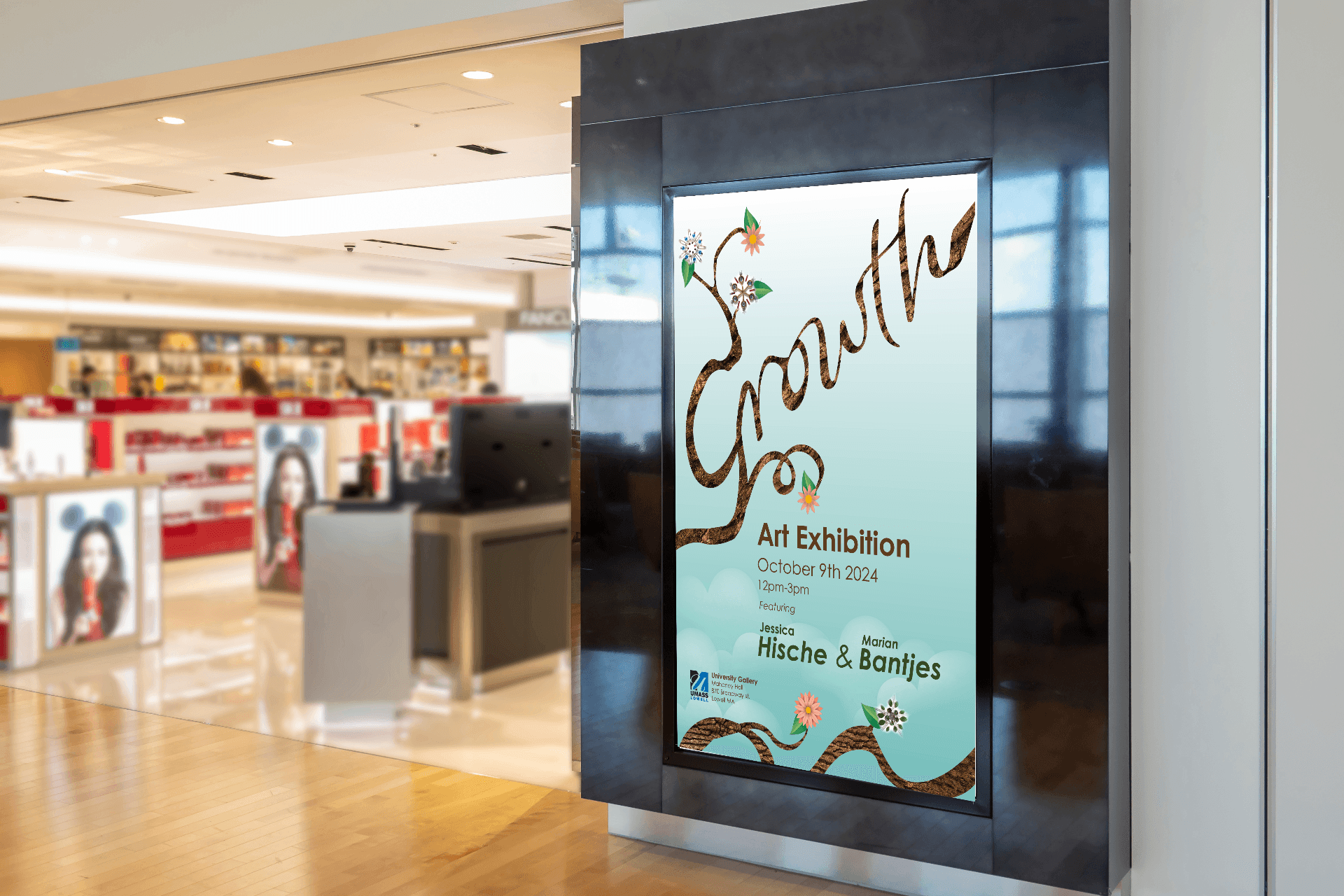
I melded my hand drawn type to a similar font, used Jessica's clouds, and flowers along with Marian's flowers with the use of real bark texture.
INITIAL CONCEPT
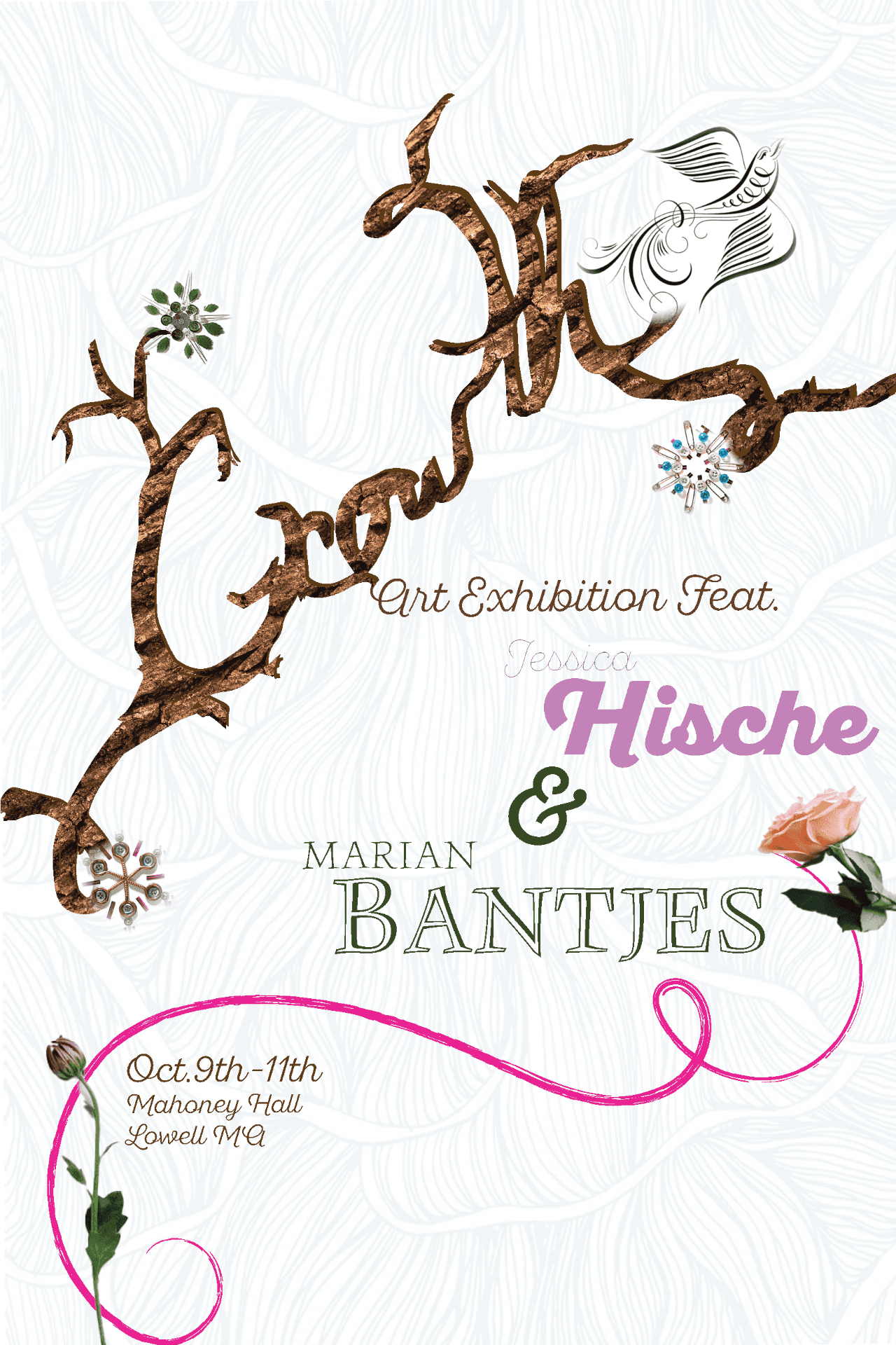
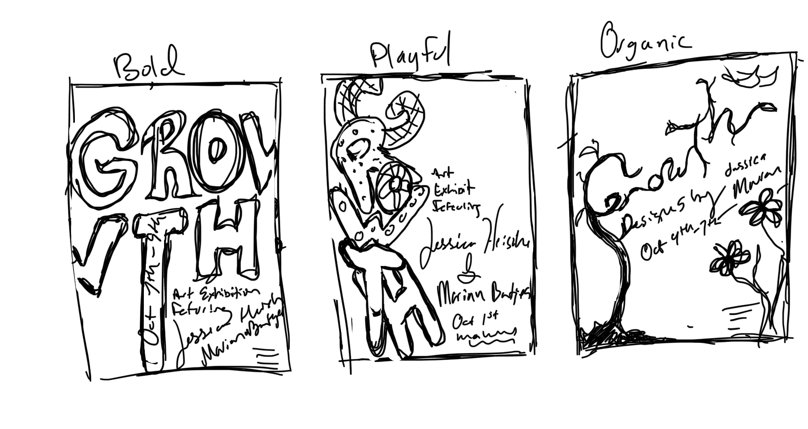
Custom hand-drawn letterforms filled with natural bark texture, complemented by jewel-like floral accents and a
soft sky gradient that evokes growth and possibility.
PROCESS WORK
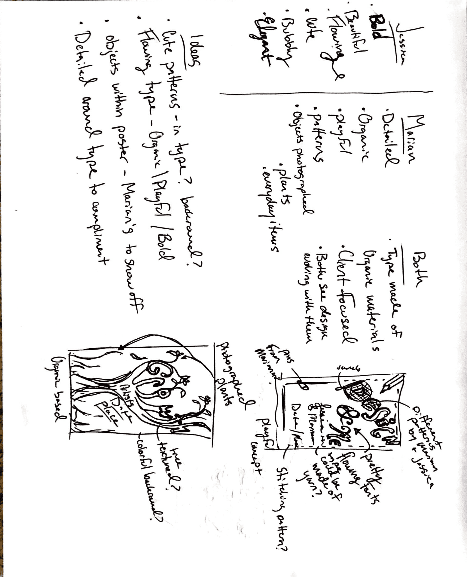
When I read about each artist they talked about their growth as an artist and how much that meant to them seeing their work evolved over the years so I felt it appropriate to create a poster that I could see the two of them working on together.


POSTER DESIGN
GROWTH
Two artists, nature, growth & design
Two artists, nature, growth & design
DESIGN PROCESS
Two artists were chosen for this quick poster project. Jessica Hische and Marian Bantjes. I chose them both based on their love of integrating nature into their work. Looking through their portfolios and statements, I found they both had an interest in growing as artists and thought that if they were to have an exhibit together, it would be one about how they have grown; thus, the title "Growth" was chosen. I blended both Marian's and Jessica's flowers and Jessica's clouds together in this poster, along with a bark-textured typography that reaches above the sky. The typography was inspired by Jessica's typography using tree branches , and the texture from Marian, as she uses real nature texture vs. Jessica's vectors. This poster and research were conducted in less than a month.
FINAL DESIGN
I melded my hand drawn type to a similar font, used Jessica's clouds, and flowers along with Marian's flowers with the use of real bark texture.
INITIAL CONCEPT
Custom hand-drawn letterforms filled with natural bark texture, complemented by jewel-like floral accents and a soft sky gradient that evokes growth and possibility.
PROCESS WORK
When I read about each artist they talked about their growth as an artist and how much that meant to them seeing their work evolved over the years so I felt it appropriate to create a poster that I could see the two of them working on together.