MOBILE APP DESIGN
The Sweet Life
A recipe manifesto for living life
DESIGN PROCESS
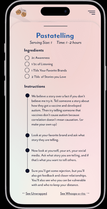
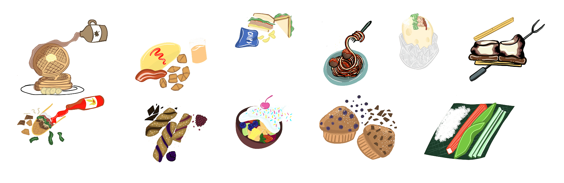
Tasked with what I would create for a manifesto my first thought was food. I was a cook for a long period in my life and I still get excited to cook at home whether its experimenting, creating new dishes, or improving old dishes. I was inspired by a baker who I follow on Instagram who created an app for her recipes. I love cook books, but having them on your phone where you can pull it up quickly and not worry about staining it can be ideal. I created different vector illustrations on Adobe Fresco and created play on words for each recipe. It was very challenging to think of what would be the ingredients that would help the user enact each point on how to live a good life. This challenged me in many ways from finding the right words to creating something that was meaningful and functioned smoothly as many components I was learning how to do for the first time.
The App
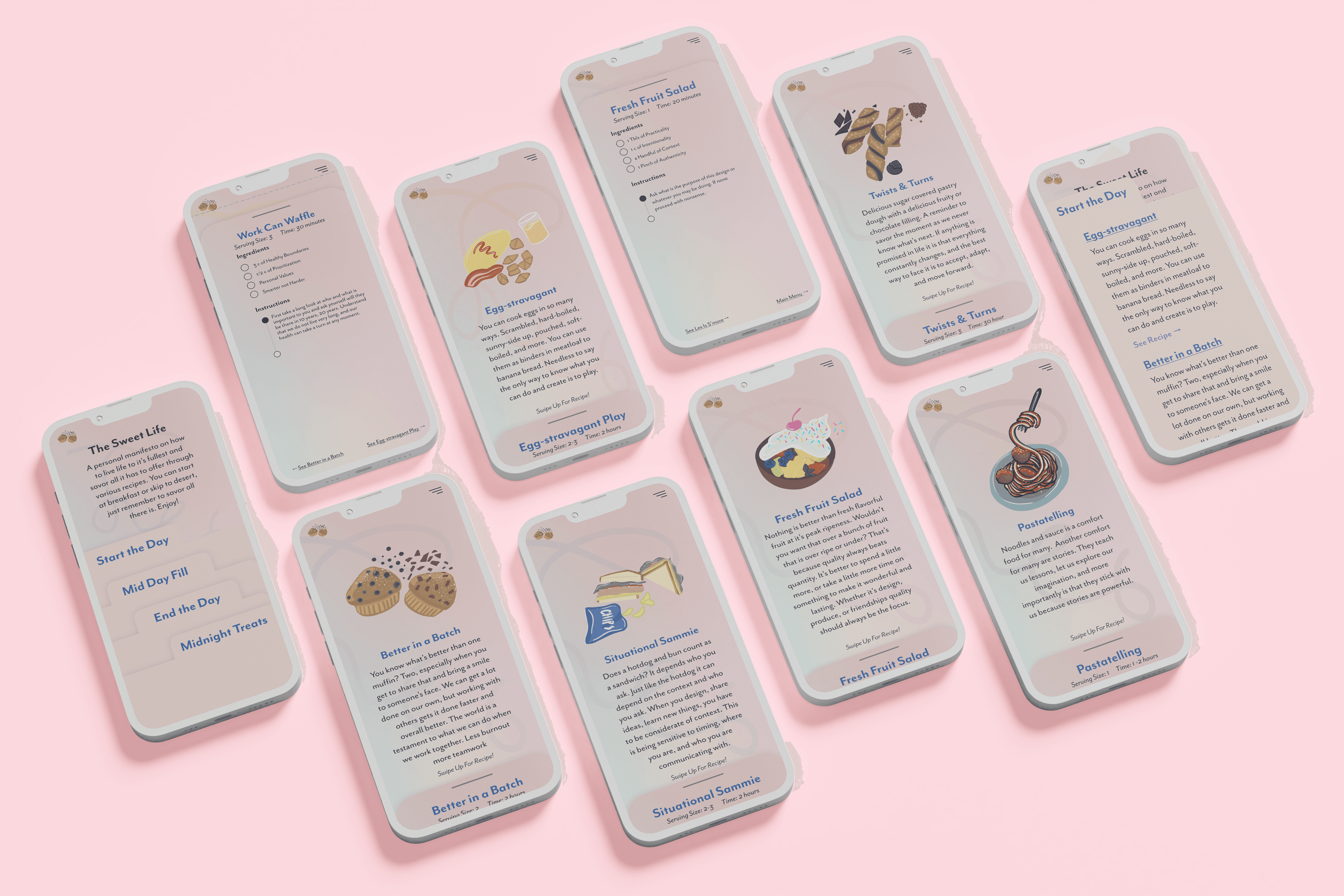
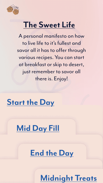
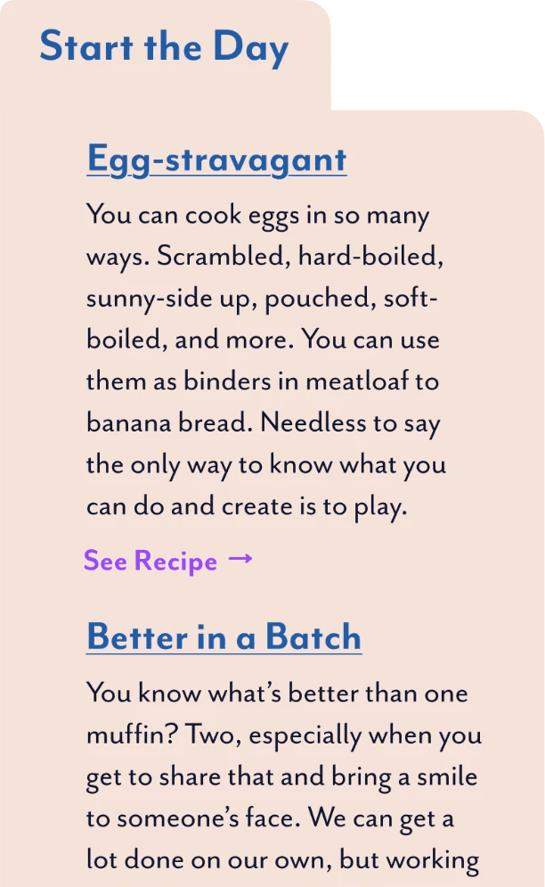
Overall the App has a pink peachy dream look to it with a gradient throughout. Pink is a calming color, and reminds me of the feminine that I associate with cooking. Being in a male dominated culinary industry it's easy to forget the feminine in it. Food is the nutrients that keep us alive, philosophy is what keeps us moving forward, and design is that philosophy in action.
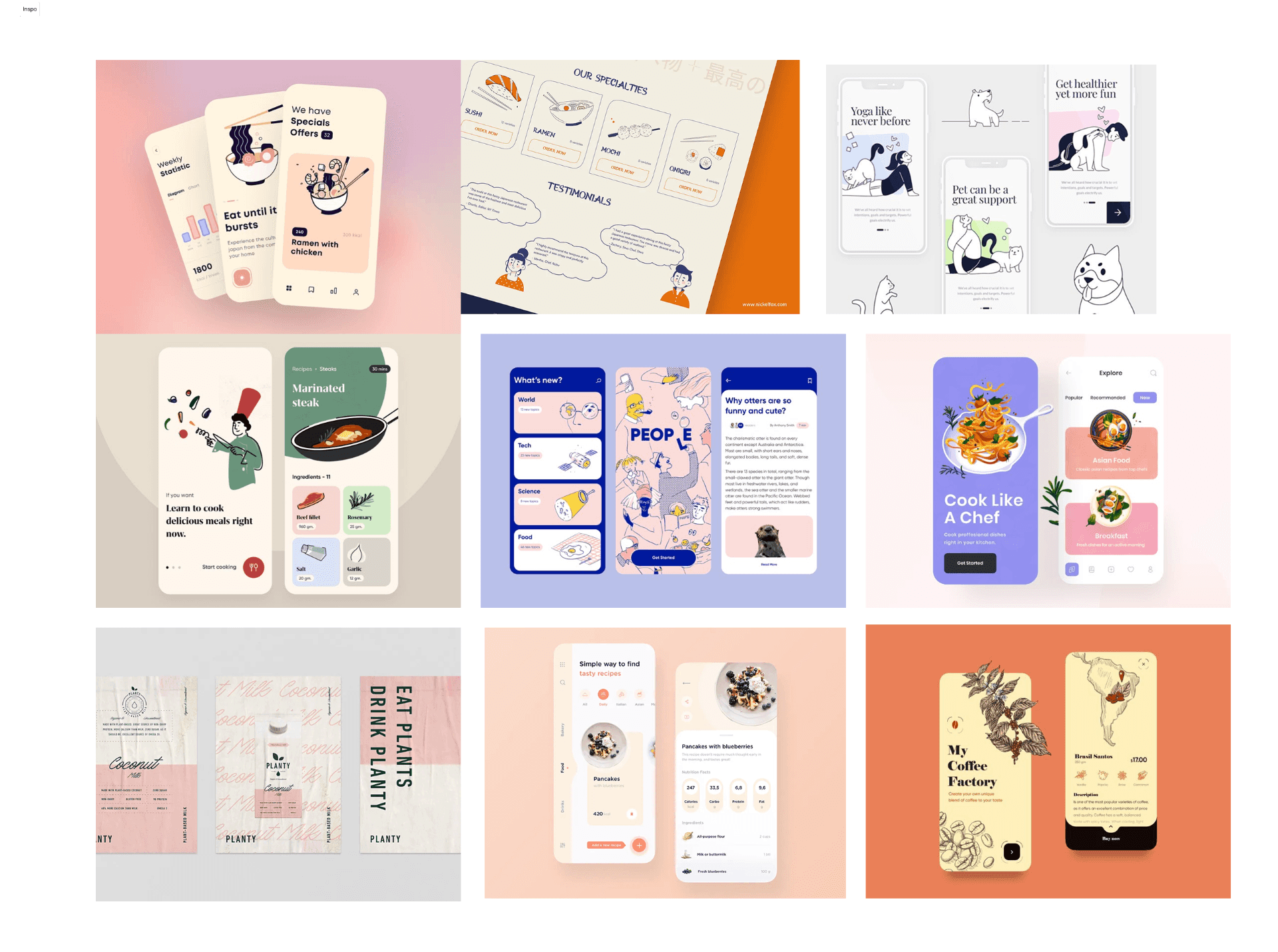

Mood Board/ Color
I went through Dribbble to gather inspiration and found many different cooking apps that helped me decide how I wanted to focus my app on. Simple and illustrative became the goal with a user interface that gave you a feeling of being in the kitchen.
Wireframes
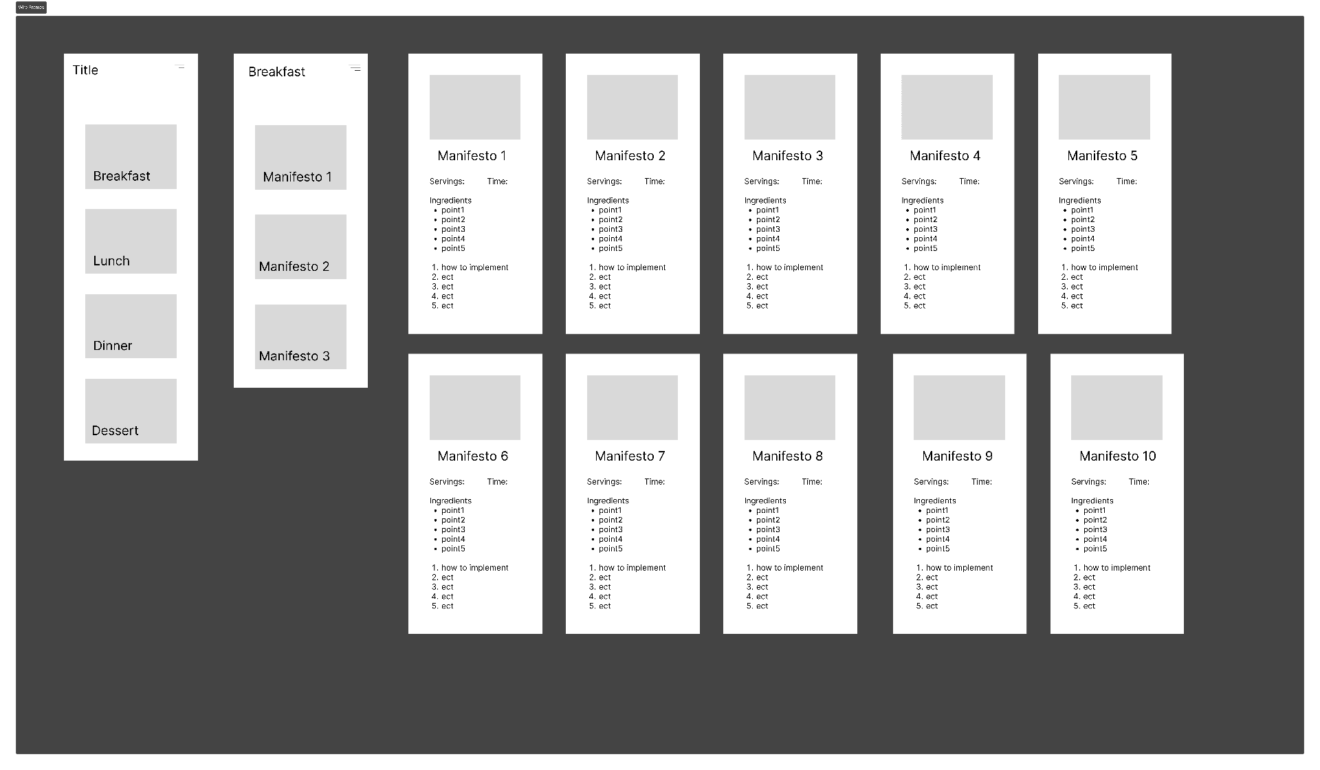
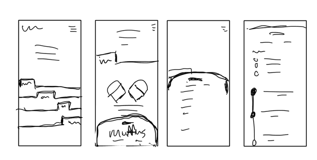
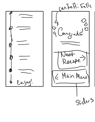
My wireframes were kept simple and to the point. I did end up changing the home screen and sub categories into a tab like interaction as though you were going through old written recipes to give a more interesting user experience of being in the kitchen.