WEB & APP DESIGN
San Andreas Fault
A website and app to better explore California's fault line
DESIGN PROCESS
The original San Andreas Fault website looks like the early 2000's never left it, and so I was tasked with redesigning it to make it both user friendly and modernized. There was no hierarchy, busy backgrounds, and overall hard to navigate. Full of memes and silly icons it was a blast from the past. For 3 months I delved into making a user persona, looked through similar places like state parks, and gathered information to create what the site map should be while prioritizing the user's needs. From wireframing to having it user tested I made sure that the website helped get the user to where they needed to go.
WEB & APP DESIGN
San Andreas Fault
A website and app to better explore California's fault line
DESIGN PROCESS
The original San Andreas Fault website looks like the early 2000's never left it, and so I was tasked with redesigning it to make it both user friendly and modernized. There was no hierarchy, busy backgrounds, and overall hard to navigate. Full of memes and silly icons it was a blast from the past. For 3 months I delved into making a user persona, looked through similar places like state parks, and gathered information to create what the site map should be while prioritizing the user's needs. From wireframing to having it user tested I made sure that the website helped get the user to where they needed to go.

Process Work
Site Map
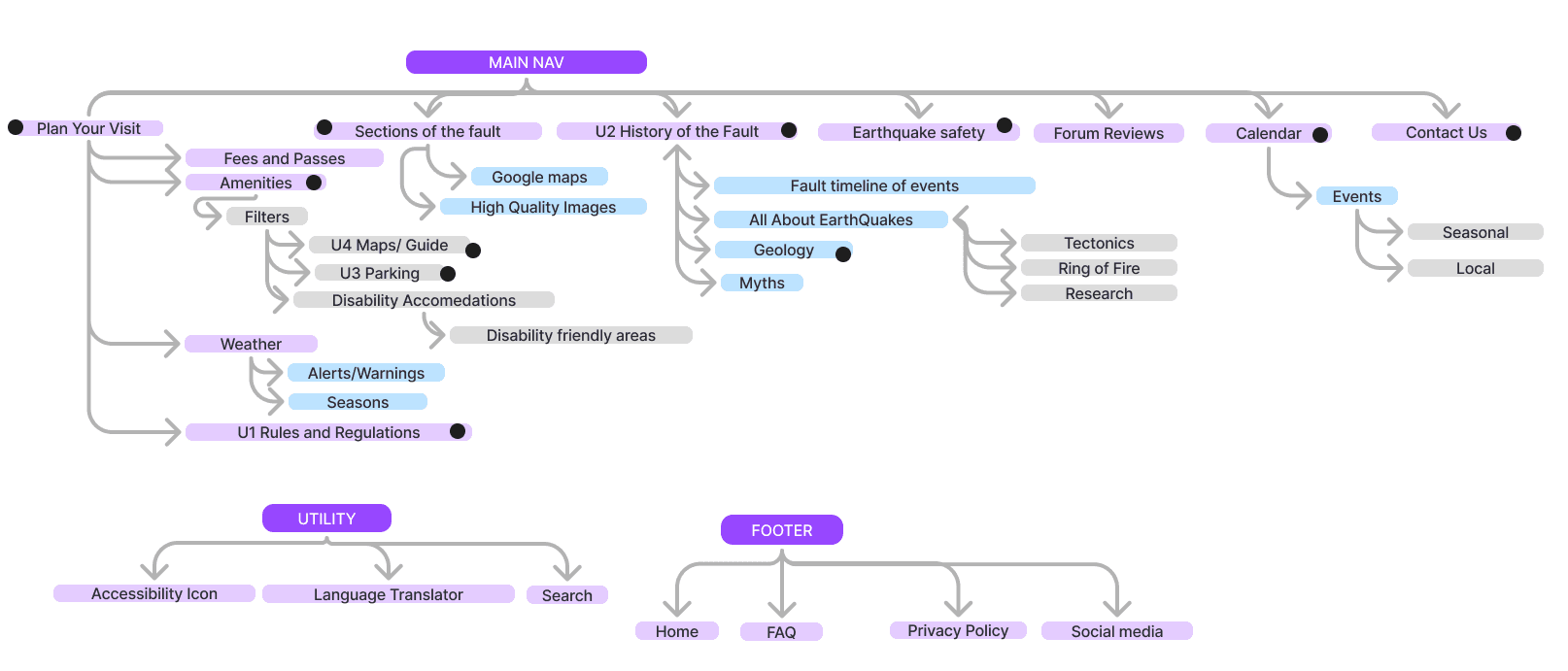
Created a giant map for all wants and needs and then highlighted most important to focus on.
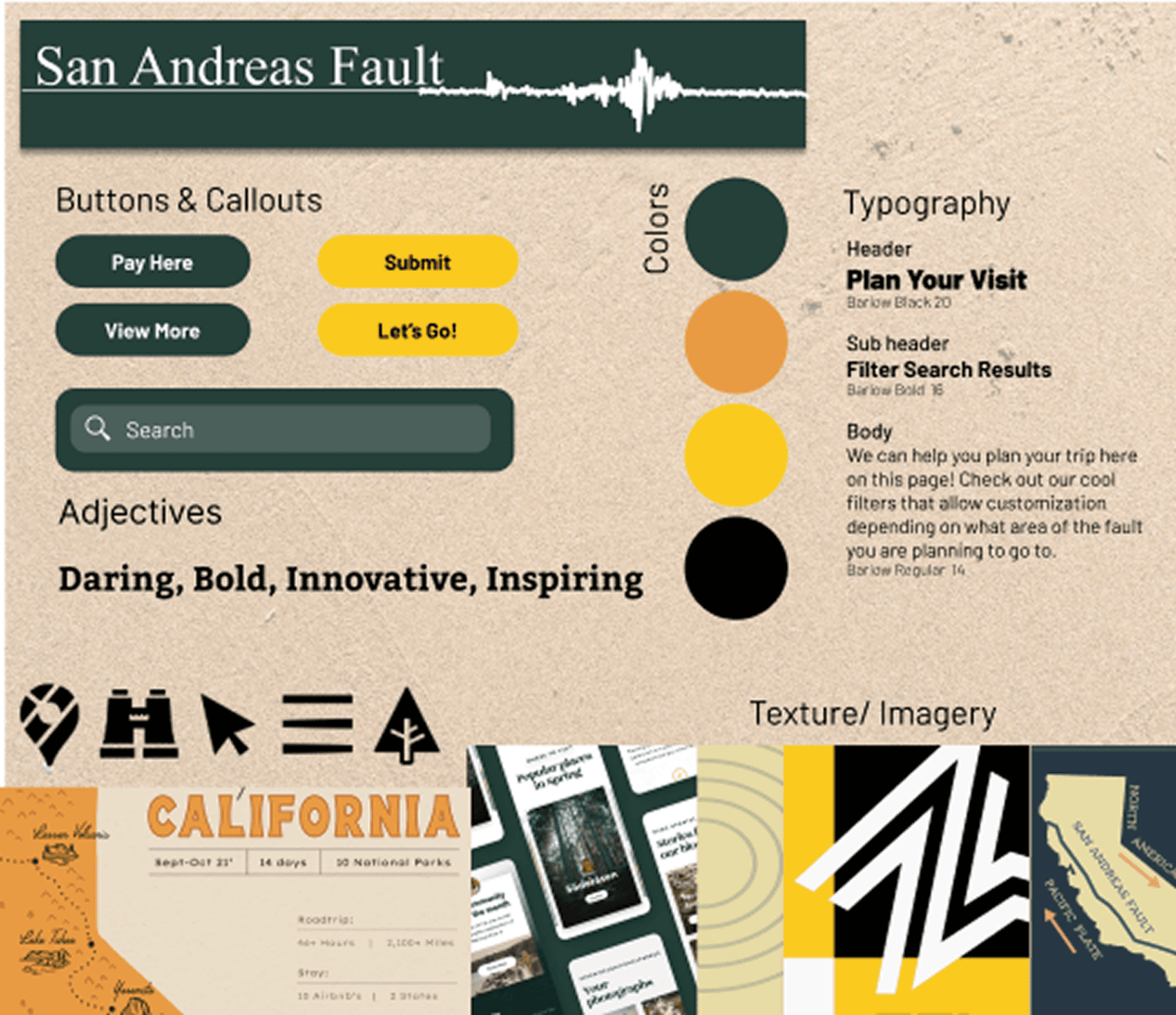
Color, Typography, Logo, Icons, Buttons, Texture and Imagery
Mood Board
User Persona

Target user research and persona development through looking at wants and needs
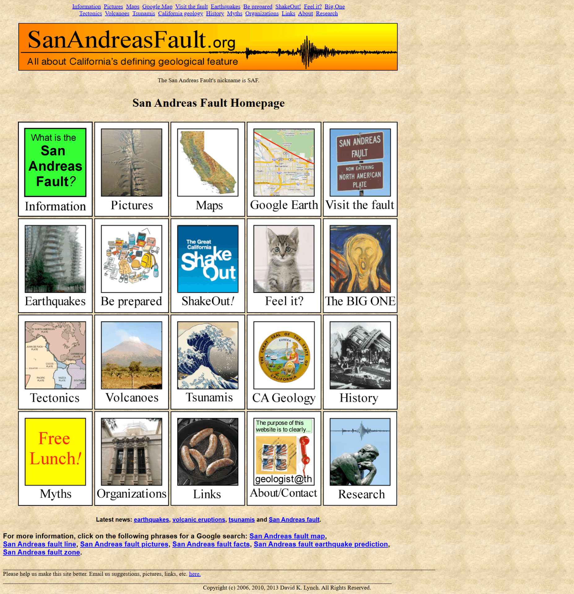
Before
After
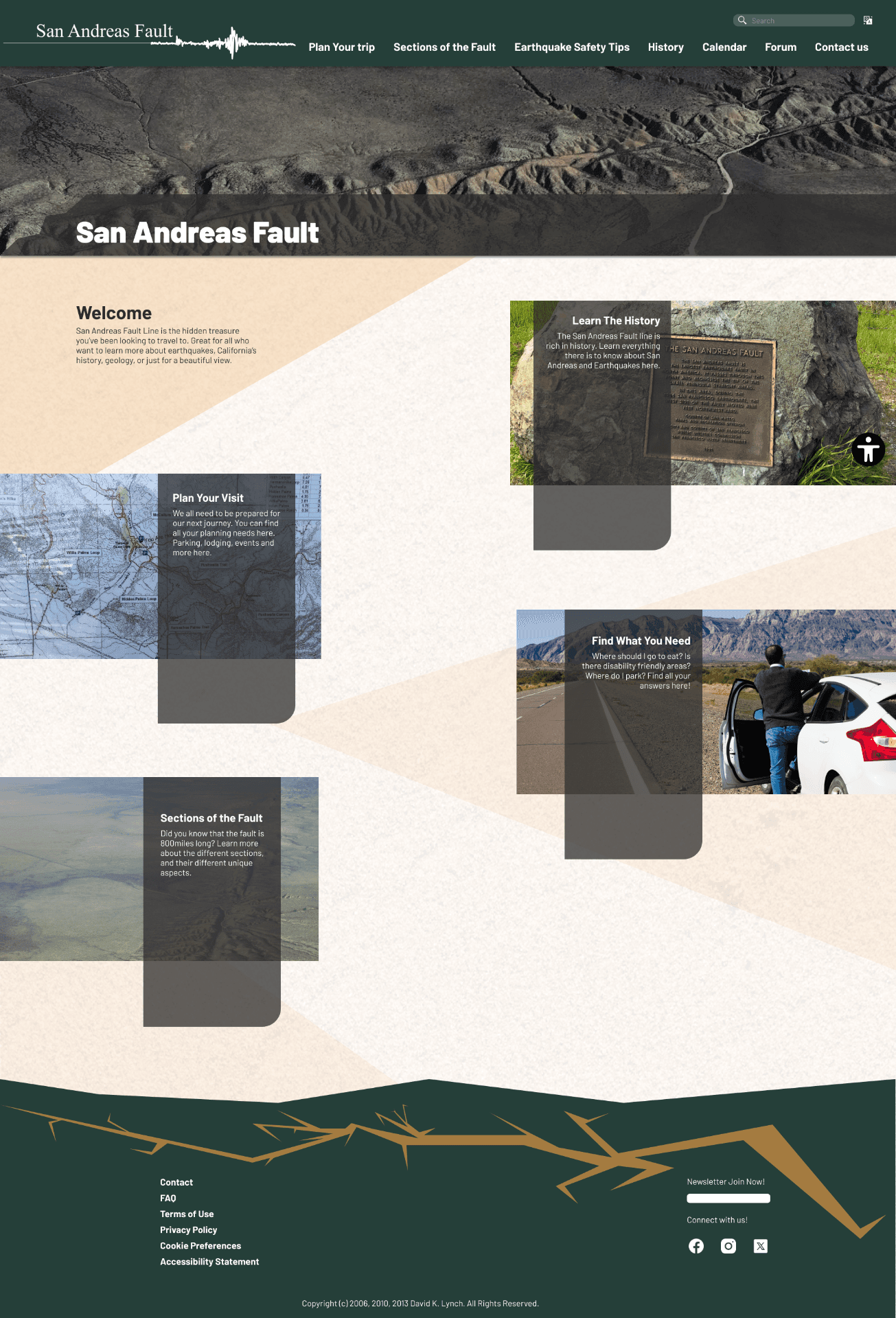
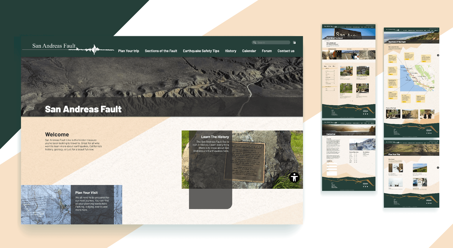
Website redesign
This is the website home page and the final homepage I created.
The App
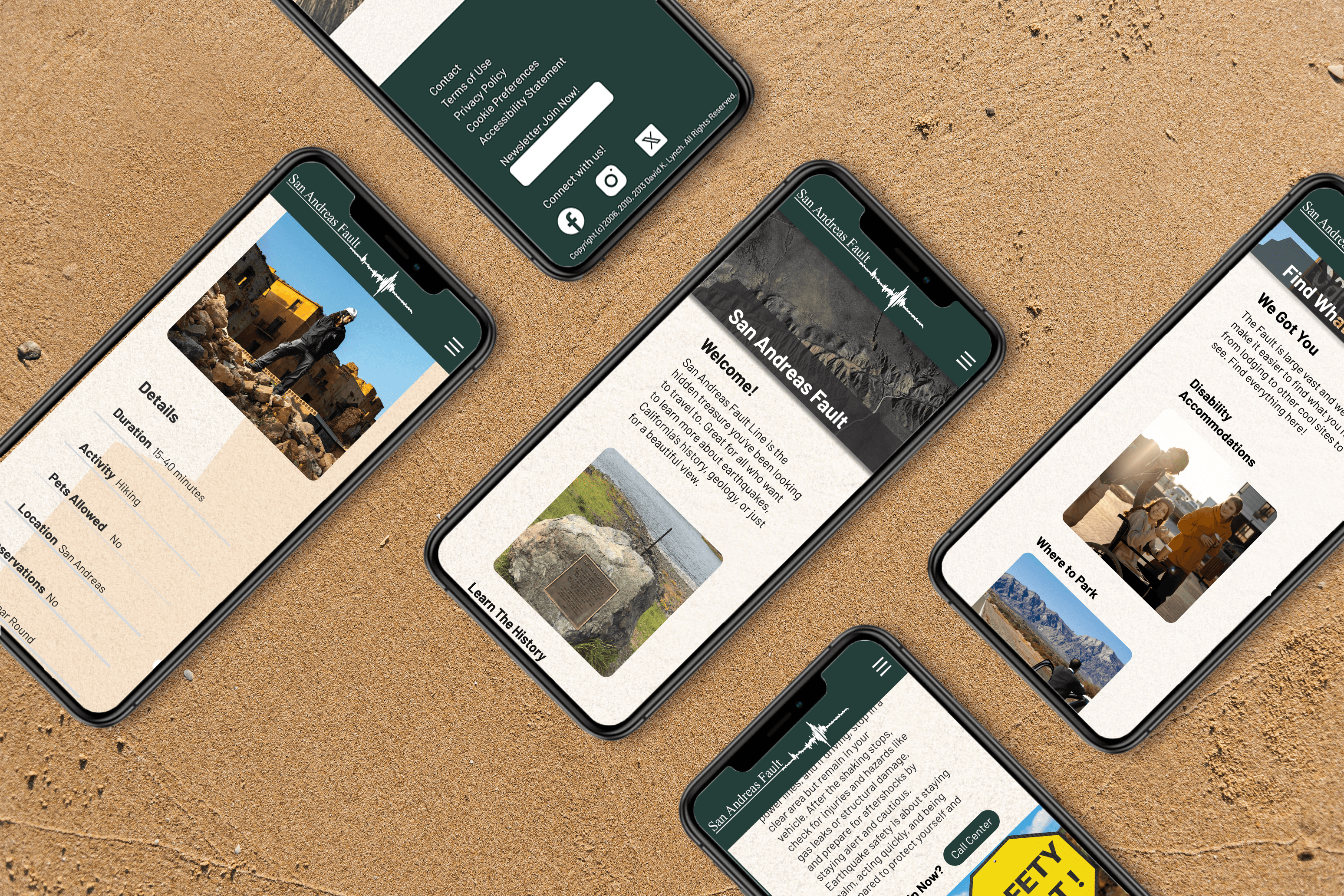
There was no app version of the site, and from researching it seemed that the majority of people would be using the web interface more and so I started with the website and then designed the app. I use
Wire frames and Prototype
This is the final product made on Figma from wireframing to the 9 page website and 10 page app. Feel free to explore and click the link if it is not showing up for you. Overall this gave me a great insight on accessibility and how the main goal of sites is not too look the best or be super interactive, but to be able to be navigated by everyone. When we create it has to function over being aesthetically pleasing. Both is ideal, but if the user cannot get to what they need then the website or app is a failure. As you will see I put the accessibility button as a sticky on every page so no matter where you are you have it if you need it. I hope to explore more on accessibility as I follow many disabled creators who remind me that they exist and when we build the world for them we build it for everyone.
View Prototype
Wire frames and Prototype
This is the final product made on Figma from wireframing to the 9 page website and 10 page app. Feel free to explore and click the link if it is not showing up for you. Overall this gave me a great insight on accessibility and how the main goal of sites is not too look the best or be super interactive, but to be able to be navigated by everyone. When we create it has to function over being aesthetically pleasing. Both is ideal, but if the user cannot get to what they need then the website or app is a failure. As you will see I put the accessibility button as a sticky on every page so no matter where you are you have it if you need it. I hope to explore more on accessibility as I follow many disabled creators who remind me that they exist and when we build the world for them we build it for everyone.
View Prototype
WEB & APP DESIGN
San Andreas Fault
A website and app to better explore California's fault line
DESIGN PROCESS
The original San Andreas Fault website looks like the early 2000's never left it, and so I was tasked with redesigning it to make it both user friendly and modernized. There was no hierarchy, busy backgrounds, and overall hard to navigate. Full of memes and silly icons it was a blast from the past. For 3 months I delved into making a user persona, looked through similar places like state parks, and gathered information to create what the site map should be while prioritizing the user's needs. From wireframing to having it user tested I made sure that the website helped get the user to where they needed to go.
Process Work
Site Map
Created a giant map for all wants and needs and then highlighted most important to focus on.
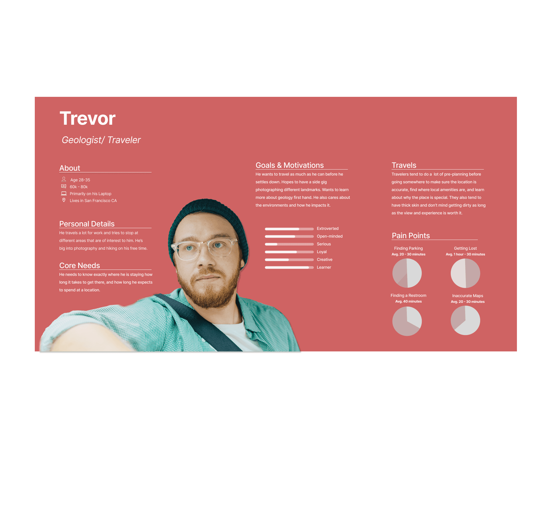
User Persona
Target user research and persona development through looking at wants and needs
Mood Board
Color, Typography, Logo, Icons, Buttons, Texture and Imagery
Before
After
Website redesign
This is the website home page and the final homepage I created.
The App
There was no app version of the site, and from researching it seemed that the majority of people would be using the web interface more and so I started with the website and then designed the app. I use
Wire frames and Prototype
This is the final product made on Figma from wireframing to the 9 page website and 10 page app. Feel free to explore and click the link if it is not showing up for you. Overall this gave me a great insight on accessibility and how the main goal of sites is not too look the best or be super interactive, but to be able to be navigated by everyone. When we create it has to function over being aesthetically pleasing. Both is ideal, but if the user cannot get to what they need then the website or app is a failure. As you will see I put the accessibility button as a sticky on every page so no matter where you are you have it if you need it. I hope to explore more on accessibility as I follow many disabled creators who remind me that they exist and when we build the world for them we build it for everyone.
View Prototype